
The Receipt
Where a Paycheck Actually Goes Furthest
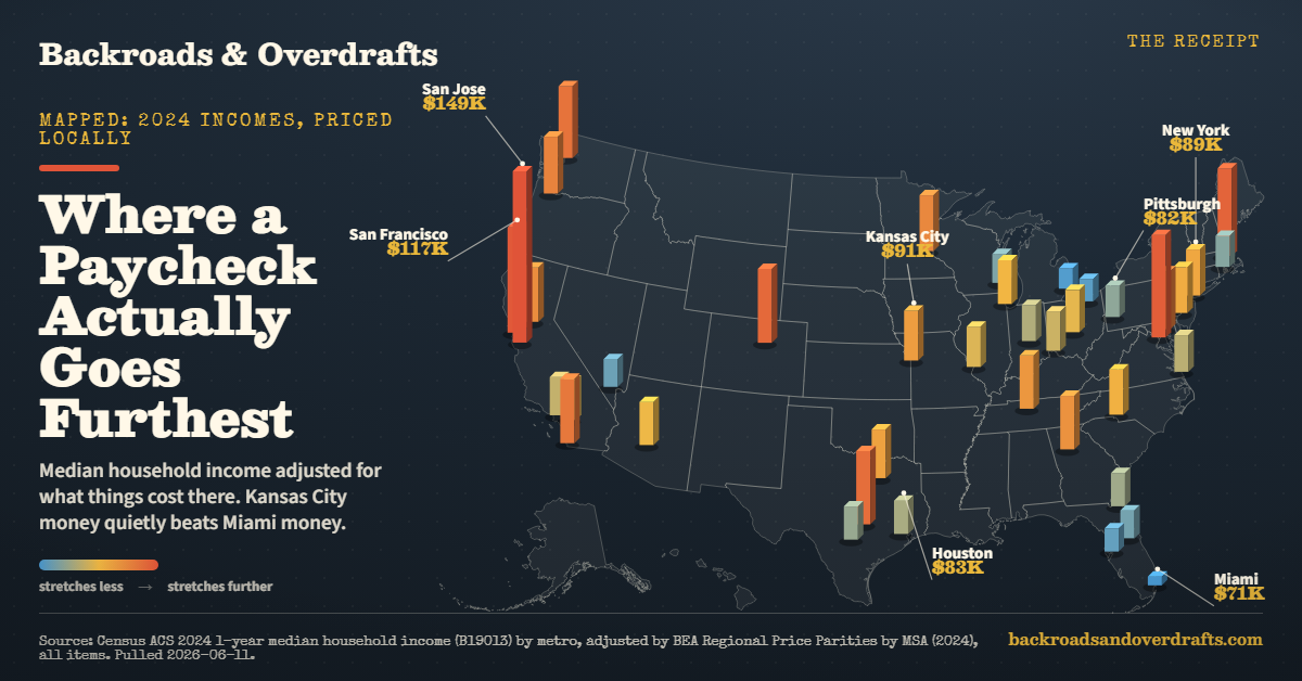
We took the median household income in 40 big metros and adjusted it for what things actually cost there. Kansas City money quietly beats Miami money.
Everybody has had this conversation at a kitchen table. Somebody gets a job offer in a bigger city, the number sounds amazing, and then somebody older says the thing that deflates the room. Sure, but what’s rent out there?
That instinct is correct, and you can actually measure it.
The Census Bureau tracks the median household income in every metro. The Bureau of Economic Analysis tracks how expensive each metro is compared to the national average, a number called a Regional Price Parity. Divide one by the other and you get something more honest than a salary: what the middle paycheck in each city is actually worth once local prices get a vote.
The part nobody puts in the job offer
San Jose still wins. Tech money is so far ahead that even 16 percent higher prices cannot drag it back to the pack. The median household there earns $164,801, which spends like $149,245.
The story is everywhere else on the map.
Kansas City is the quiet winner. The median household earns $83,785, but prices there run about 7 percent below the national average. That paycheck spends like $90,536.
Miami is the other side of the coin. The median household earns $80,625, almost the same as Kansas City. But Miami prices run about 14 percent above the national average, so that paycheck spends like $70,628.
Same size paycheck. About a $20,000 difference in what it buys. That is the whole chart in one sentence.
Who gains and who gives it back
Once prices get their vote, these metros gain the most spending power:
- Kansas City: $83,785 earns, spends like $90,536 (+8.1%)
- Cleveland: $72,532 earns, spends like $77,225 (+6.5%)
- San Antonio: $78,112 earns, spends like $82,470 (+5.6%)
- Pittsburgh: $77,214 earns, spends like $81,560 (+5.6%)
- St. Louis: $81,679 earns, spends like $85,898 (+5.2%)
And these give the most back at the register:
- San Francisco: $135,590 earns, spends like $117,279 (-13.5%)
- Miami: $80,625 earns, spends like $70,628 (-12.4%)
- Los Angeles: $96,405 earns, spends like $84,889 (-11.9%)
- New York: $99,852 earns, spends like $88,708 (-11.2%)
- San Diego: $109,132 earns, spends like $97,538 (-10.6%)
New York deserves a second look. The median household there clears just under six figures, which sounds like winning. Adjusted, it spends like $88,708, which is less than Kansas City. The skyline costs extra.
This is the same squeeze we keep finding on individual receipts. Home prices pulled away from incomes in most of these expensive metros, which we charted in Home Prices Pulled Away From Income. And the grocery line moves the same direction, which is why the same name-brand cart costs $10 more in Los Angeles than in West Virginia.
A paycheck can win on paper and lose in real life
Adjusted income is a clean way to compare metros, but a move is never just a spreadsheet.
Before treating a high adjusted-income metro like a green light, check the friction:
- Rent for the neighborhood you would actually live in.
- Commute cost, especially if the cheaper rent is far from work.
- Childcare, insurance, property tax, and utility rates.
- Whether the job market fits your actual trade, not just the median household.
The ranking is a shortlist, not a moving plan. That distinction saves people from chasing a cheap city that is only cheap for someone else’s life.
Useful source trail: the income side comes from Census ACS median household income, and the price adjustment comes from BEA Regional Price Parities. The public source pages are Census data tables and BEA’s regional price parity data.
The caveat
These are metro-wide medians, so they smooth over a lot. Neighborhoods inside a metro vary enormously. The price parity adjusts for price levels, not for state taxes, commutes, weather, or being near your grandkids, and those count too. Income is the 2024 survey year, the latest published.
But if you have ever wondered why your cousin in Kansas City seems weirdly relaxed about money on a normal salary, this is the math under that feeling.
What is the cheapest place you have ever lived, and did your paycheck actually feel bigger there?
Keep going
If this price check hit the same nerve as your last grocery run, A Bag of Starbucks Costs How Much Now? keeps the receipt math going.
For a cheaper table-level fix, How the House Got Out of Reach turns the same pressure into dinner.
And when you want a break from the numbers, How Your Coffee Quietly Doubled is the kind of small outing that still works.
Source: U.S. Census Bureau, American Community Survey 2024 1-year estimates, median household income (table B19013) by metro area, adjusted using Bureau of Economic Analysis Regional Price Parities by metro area (2024, all items). Adjusted income = income divided by (RPP/100). Pulled 2026-06-11.
Keep reading
More from The Receipt
 The Receipt
A House Used to Cost 4 Years of Work. Now It Is Closer to 6 and a Half.
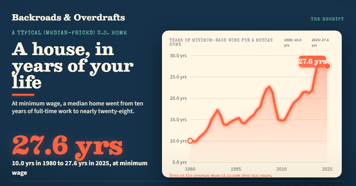
Measured in years of full-time work instead of dollars, a typical American home went from about 4.5 years of the average wage in 1980 to 6.4 today, and from 10 years to nearly 28 at minimum wage. The median price climbed from $64,750 to $415,400.
 The Receipt
A Year of College Now Costs More Than a Year of Work
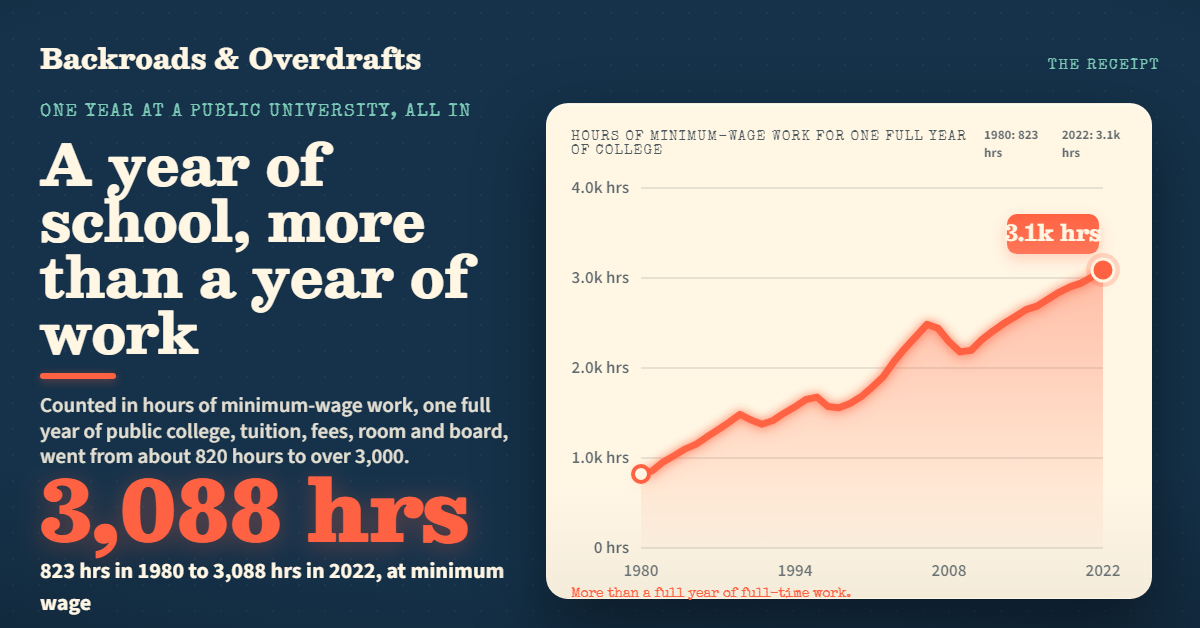
Add up everything one year at a public university actually costs, tuition, fees, room and board, and price it in hours of work. It went from about 820 hours of minimum-wage work in 1980 to over 3,000 today. The bill climbed from $2,550 to $22,389.
 The Receipt
The House Is Paid Off. The Tax Never Is.
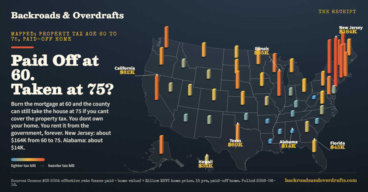
Pay off your mortgage at 60 and the county still bills you every year. We mapped what 15 years of property tax costs on a paid-off home in all 50 states. New Jersey, about $164,000. Alabama, about $14,000.